Like many other Google services, the Maps software will also yield to the call of Material Design, with some small aesthetic changes.
 A few weeks ago, the inevitable Gmail had a new look on iOS as on Android, with a brand new interface . Very soon, it will be the turn of Google Maps to give way to the call of Material Design so dear to Google.
Google Maps in Material Design sauce
The famous mapping software will offer a whole new look, with obviously new icons all round , a blue background replaced by a white background, a thicker writing font .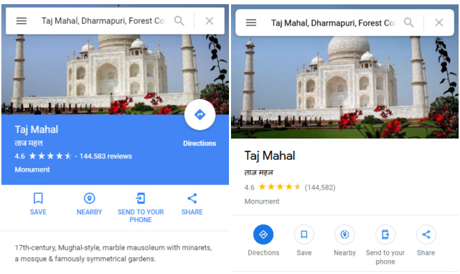
The search bar at the top of the screen will also have some modifications, with more rounded angles and more readable results. The Location and Close buttons will have a new blue background. No aesthetic upheaval in sight for this "new" Google Maps , but subtle changes that allow Google to standardize its services.